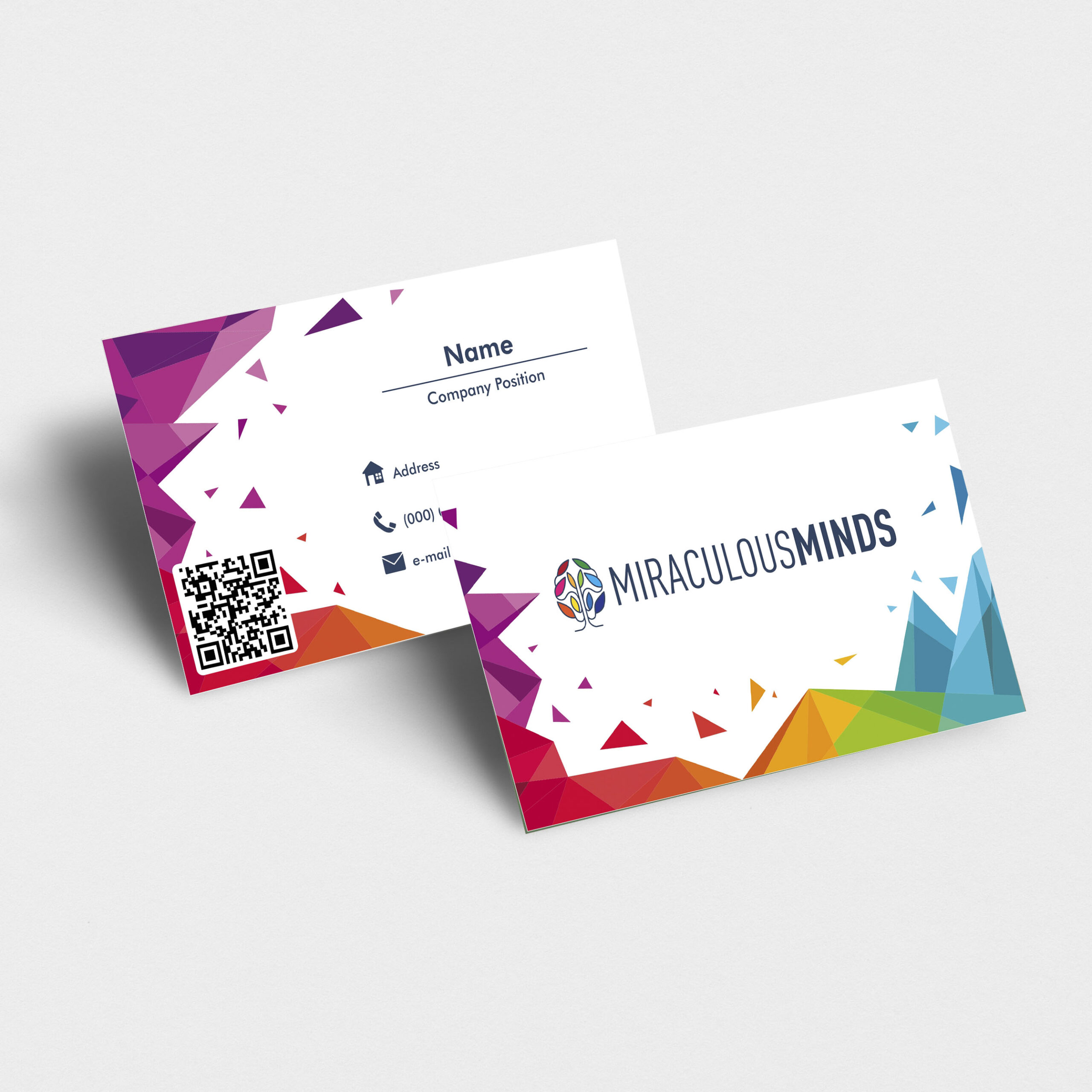
2. The Challenge Balancing creativity and legibility: The brand wanted vibrant, artistic visuals but not at the expense of information being clear and accessible. Brand consistency: Ensuring the design reflects the brand identity (name, logo, color scheme) cohesively across both front and back of card. Multiple contact points: Besides phone and email, including modern features like a QR code without overwhelming the layout. Visual impact: Standing out from typical business cards, especially in creative or tech‐connected industries, while preserving professionalism. 3. Our Approach Brand audit / mood exploration: We reviewed the existing logo (colorful “brain / network” motif), tone of the name “Miraculous Minds,” and what those suggest in terms of color, shape, and form (innovation, creativity, intelligence). Sketching & layout exploration: Rough layouts where geometric shapes frame or accent content, experimenting with placement of logo, name, and contact info. Color palette refinement: Choosing bold, vibrant shades but ensuring contrast (especially text vs background) remains high for readability. Iconography and interactivity: Deciding on clean icons for contact methods; integrating a QR code for digital linkage. White space and simplicity: Leaving breathing room so that strong visuals don’t clutter the card or distract from essential text. 4. The Solution Design composition: Front: Big bold logo + company name with vibrant geometric edge at the bottom right; clean and impressive. Back: Contact info laid out simply; decorative polygons on the left side; QR code inserted to invite scanning without dominating. Typography: Use of sans‐serif fonts — bold for the company name, lighter weight for other elements like name, position, and contact details — to maintain hierarchy. Graphic motif: Low‐poly triangle clusters in multiple bright colors (purple, red, orange, green, blue) to reflect energy and multi‐faceted creativity. Functional features: Icons to quickly show address / phone / email; QR code for fast digital access; alignment and spacing so the eye flows logically. 5. Outcome & Key Takeaways The business card delivers strong brand recognition at first glance thanks to its bold graphics and cohesive logo integration. Contact information is clear and easily accessible, with modern features (QR code) adding usability. The visual flair sets it apart from more conservative business cards, helping Miraculous Minds present itself as innovative and creative. Key design lessons: vivid color + geometric forms can enhance brand personality, but attention to typography, spacing, and hierarchy is essential to retain clarity.